Bay Laurel Construction

Bay Laurel Construction is a full-service, home renovation and construction company based in California USA

Scope

UI/UX Design

Website Development

Logo Design

Brand Collaterals

Asset

Logo Design
& color theme

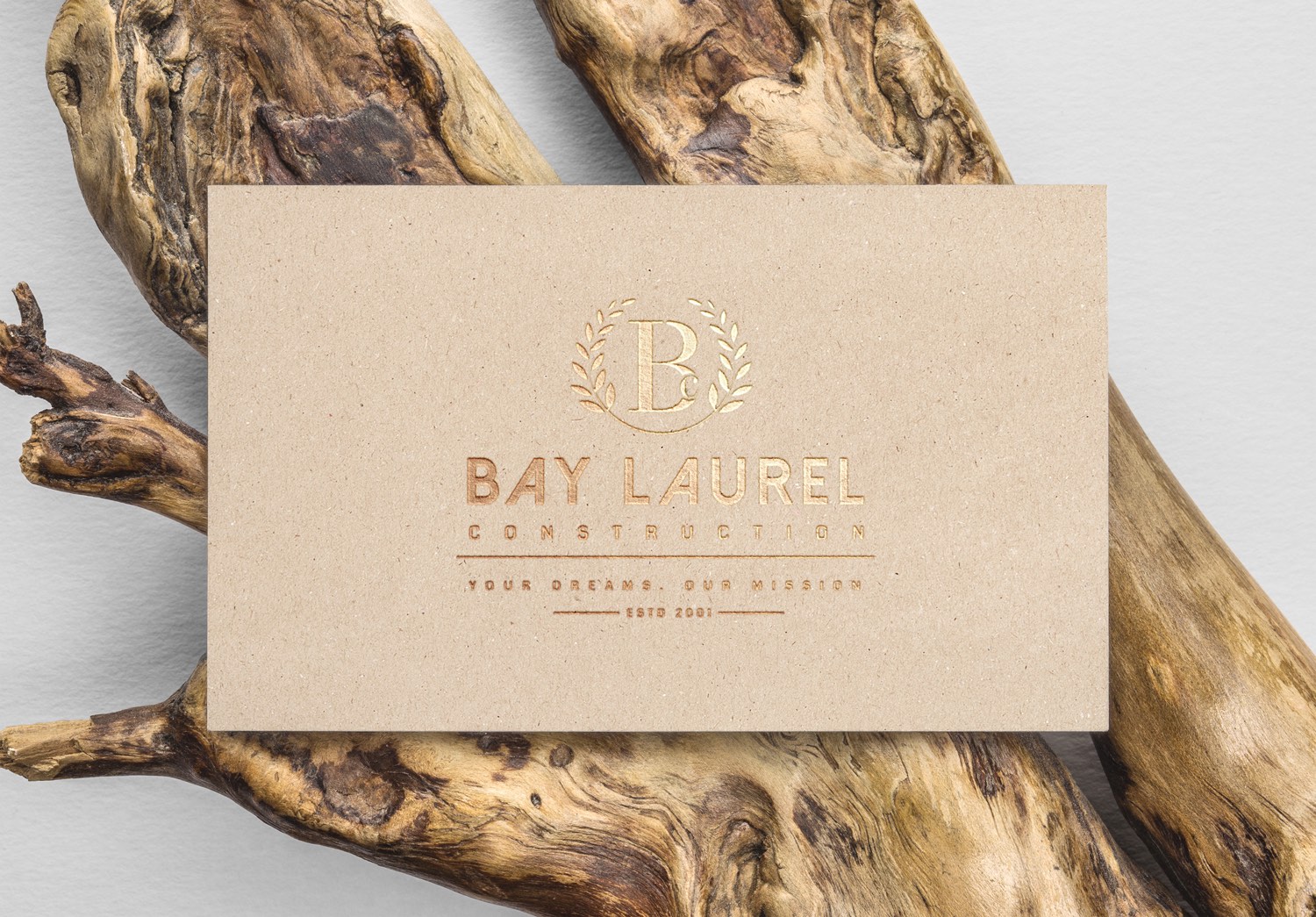
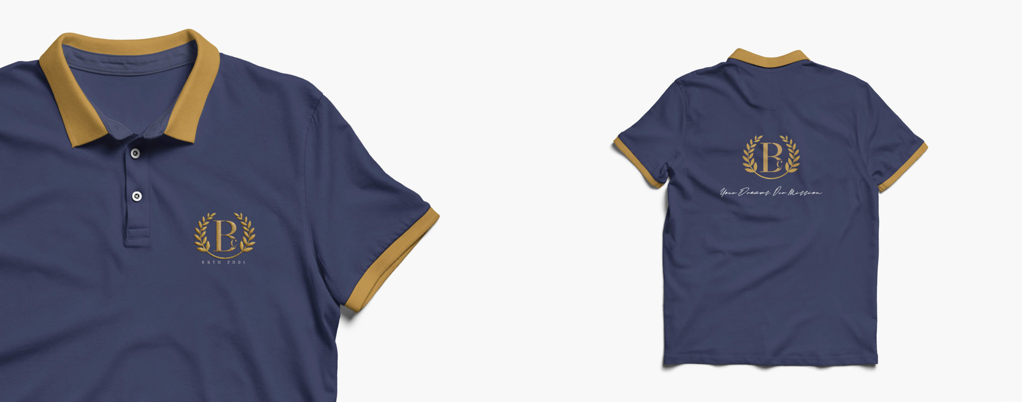
We chose the colors dark blue and gold to represent Bay Laurel as blue portrays reliability and strength. The meaning of the color Gold is multifaceted, often denoting generosity and compassion, as well as being synonymous with divinity and power. The amalgamation of royal blue with gold is reminiscent of luxury, success, achievement, triumph, and fortune. The logo composition is a blend of brand name initials (B&L), wreath symbol which denotes growth and eternity.
3 8


THE JOURNEY

We have recognized the essential brand value elements of the brand to design a modern corporate style logo face and an impactful, informative website design.    The look of the website is yet simple and appealing. And we have designed the UI / UX  to excellence by using the company’s project images and by choosing a lively color palette.
0 1 1
4 4